Our Work
Learn more about some
of our projects.


It's Good to Grow
Whitefish Credit Union began modestly in 1934, with five railroad employees contributing $5 each. Now, they are Montana’s largest Credit Union, with over $1 billion in assets. In 2011, they turned to Grid for guidance in elevating their marketing to match their level of growth.
Let's Make a Plan
The first step was to adjust Whitefish Credit Union’s approach to marketing; to move away from reactionary marketing in favor of advanced planning that would allow us to create campaigns that had more effective messaging and reach. We worked closely with the client to put together a comprehensive, year-long marketing plan that outlined things such as specific business goals, a detailed timeline and platform strategy to meet those goals, and estimated costs for their budgeting purposes. This plan, which evolves annually, helps guide marketing decisions throughout the year and let’s us maximize our client’s budget and return on investment.
From there, we systematically re-approached all areas of marketing - from their television, radio, print and digital ads, to the signage on/in their buildings and their collateral - bringing each area into alignment with the marketing plan. We also brought the production of all advertisements in house, ensuring that all ads were consistent in branding, conveyed a unified message that drove towards a business goal, were of professional quality, were compliant with Federal and State laws, and adhered to the regulations of the National Credit Union Association. One of our most exciting pieces of work that we do each year is a regional Super Bowl ad that highlights one of Whitefish Credit Union’s key marketing campaigns for the year.
We are currently working with Whitefish Credit Union to launch of their new online banking experience, and their new Online Checking Account, which allows members to pay bills, transfer funds, view their account history and more, all online. We worked directly with a major provider of these services to make sure that the user experience on all devices (tablet, smartphone or desktop) was representative of the Whitefish Credit Union brand, that it was easy and intuitive, and that it served the needs of the members. This product, which launched in Spring 2015, has become one of the the Whitefish Credit Union’s major distinguishers from their competition, and the feedback from the members has been overwhelmingly positive.
The next stage of our work includes increasing Whitefish Credit Union’s reach into online advertising, where they can access a younger demographic that will form the basis of their next generation of members. We have very close relationships with both Hulu and Pandora, and are able to negotiate very attractive advertising packages that will bring this next stage of marketing to fruition.
Smart Marketing, Better Engagement
Before working with us, Whitefish Credit Union struggled to understand their target demographics, and how to track the effectiveness of their marketing campaigns. It was common for their marketing decisions to be based on the thought that “we did it last year, we should do it this year.” Since then, we have helped them define clear segments of their demographics, including how each segment prefers to be communicated to or with, and used this information to build a system by which we can track the effectiveness of each marketing campaign within each segment.
One method has been through on-going focus groups, which we use to gather feedback about on a range of topics, including brand perception and recognition (the “health and wellness”), the memorability of different campaigns or messaging, and the wants or needs of actual or potential members. We are also able to get demographic information direct from each media outlet, which let’s us fine tune our advertising approach for each specific geographic location, and tells us how many people have heard or seen each of our advertisements.
By spending time on each piece of the puzzle - from identifying business goals at a 10,000 foot view, to speaking to actual people who have heard or seen our advertisements - we are able to create and execute marketing campaigns that meet goals, that maximize budgets, and that make sense. We are excited to continue our work with Whitefish Credit Union for years to come.
Ready for Market
Corporate Air Parts, the company behind the Land Shark, approached Grid with their newest product - a stealth and survival bag that was more versatile and compact than current products on the market. They needed help bringing this potentially life saving product to market in a way that was professional and strategic.
Let's Get Some Press
At Grid, we recognized that the biggest obstacle to selling a product like Land Shark, a product where someone would literally rely on it during a life or death situation, was to have the product extensively tested and reviewed by industry insiders. We knew that potential customers would want to perform extensive research on the product before they purchased - and they needed to be able to find independent reviews about it’s quality, reliability and performance in the field.
One of our first steps was to put together a high-quality product demo and press kit to get a Land Shark in the hands of a wide variety of industry insiders for review purposes. We designed and facilitated the production of a high-gloss branded folder, letterhead on which we printed a customized thank you letter for every recipient (hand signed by the owner of the company), a brochure that highlighted the features of the product, stickers for promotional purposes, and a unique discount code that the reviewer could provide to their own media audiences.
We reached out to a select number of bloggers/vloggers, magazine and newspaper product reviewers, online stores and forum communities, making sure to get product demos in the hands of all sorts of outdoor enthusiasts - survivalists, emergency preppers, hunters, hikers, boaters and aviation enthusiasts, just to name a few - and encouraged these enthusiasts to perform their own independent testing of the product, in whatever manner they might find themselves using the product, and to share that unedited review with others in their communities.
The positive reviews began to pour in; from features in printed publications, such as the American Motorcyclist Magazine and American Handgunner, to popular online communities such as HuntingLife.com and The Loadout Room. The response was overwhelming! While we can’t take credit for the quality of the Land Shark product itself, we do take pride in putting together an attractive and informative kit that prompted these reviewers to take the time to evaluate the product and share it with their own communities.
The Results
The primary goal to getting these product demo and press kits out was to generate product reviews that would help drive the decision making process of potential customers. Anyone looking to purchase a potentially life saving product would rely heavily on recommendations from friends and family, and from unbiased, thorough reviews posted by independent media sources within the community that the potential buyer self-identifies with.
Since forming this solid foundation of reviews, we have continued to work with Land Shark in many other marketing areas, including branding, designing and developing their website, product packaging and photography, digital advertisements (including negotiating contracts), branded clothing, search engine marketing, blogging and social media, generating military and government sales channels, brainstorming and implementing a comprehensive affiliate marketing system, and ongoing website traffic analysis and updates.
Bringing in The Big Guns
Yarn Culture was introduced to us by a local graphic designer who was designing their website. The development needs of the website had surpassed the skill set of the designer, so we were asked to step in to oversee and execute the development and launch of this critical piece of Yarn Culture’s business.
A Blossoming Relationship
We began by collaborating with both the client and the graphic designer to build out the websites Information Architecture. This document is akin to a building’s architectural blueprint - it outlines all of the websites details (such as product price, description, blog, cart and checkout process, payment processing, class schedule, etc) and arranges them in relation to each other. This document maximizes the clients budget by ensuring that all pieces of content have a “home”, and that all functionality (and the relationships between each piece of functionality) is fully scoped out and can integrate together as needed. By spending this time up front, we minimize the timeline and budget impact that comes with last minute design or development changes while the work is mid-course.
The Informational Architecture document helped outline every graphic design element that would be needed - big or small - and where those elements would be duplicated or should remain consistent for branding purposes. By making sure elements were only designed once, and that branding remained consistent between every element, we reduced the amount of time and budget needed during the design phase of the project.
One of our highest priorities during development was to build the website in a way that was both easily updated by the client and still robust and flexible enough to accommodate future development. A website should never be viewed as “complete” - meaning, your website should adapt and change as your business or website goals shift, and/or as you analyze the traffic patterns of visitors to your website. Are you seeing a lot of traffic from a specific geographic location? You should tailor some of your content to use local terminology. Does your business want increase sales of a certain product? You should add that product into your homepage slideshow, or feature it in a blog article. Choosing the right content management system is critical for the long-term success of your website, so we spent time looking at Yarn Culture’s industry and specific website structure to determine the best fit.
The second highest priority, given that Yarn Culture is a product-based client, was to make sure that users could access and make purchases easily from any internet connected device. During every phase of the design and development we asked how mobile viewers would want specific pieces of information displayed. We implemented decisions such as making the “Add to Cart” and “Checkout” buttons larger on a smartphone or tablet, to account for having to click these buttons with a finger. We minimized the amount of ancillary product information (such as manufacturer background) shown initially on mobile view, while still providing a link to expand the information on demand. It is important to be cognizant of these questions as the design and development are occurring, to make sure that all viewers have an enjoyable purchase experience regardless of their viewing device.
With such a high quality product, Yarn Culture knew that they would need to dedicate some of their budget towards having professional photography shot of each of their products. However, as they began to stock more products, they found that it was going to be cost prohibitive to continue to have a professional photographer shoot each and every one. Instead, our in-house photographers worked with Yarn Culture, to create a repeatable photography style that would allow Yarn Culture staff to take photos themselves. We helped them select all of the necessary equipment, from the appropriate camera and lens to a brand appropriate background, and worked with them in their office to set up a photography station. This has enabled them to produce consistent, high quality photographs on demand, which has been essential to selling their products.
The Results
We launched Yarn Culture’s website in the Fall of 2013, and since then we have monitored the website’s traffic patterns and helped Yarn Culture make ongoing updates to their content and layout to improve their conversion rates. We also work with them on their ongoing marketing efforts, such as business and other branded collateral, email campaigns, product photography, search engine marketing, social media, shipping bags, and trade show displays, to make sure there is cross-platform reach and consistency. We make sure that all marketing goals drive back to making purchases on the website or in the retail store.
Expanding the Line
Made in Nature, Sunsweet’s sister company, had out grown the capabilities of their previous marketing agency. They came to Grid looking to add a new product to an existing product line, and for assistance in meeting packaging requirements both domestically and internationally.
Creating and Improving
During their relationship with their previous agency, Made in Nature had established a look and feel for their brand that they wanted to continue - including their logo and signature watermarked flourishes. They were ready to add several new products to their existing organic dried fruit line, including Deglet Noor dates, and needed packaging that was unique (each a products has it’s own color scheme) but remained visually consistent with the other products in that line.
We began our work by producing professional photography of the new products, paying particular attention to matching the overall photographic aesthetic that had already been established, such as product angle, size, and composition with other elements. Next, we made color palette selections that complimented the product, matched with the other colors in the product line, and would be eye-catching on the shelf. As we designed the final packaging we also paid close attention to all statements and labeling (including the nutritional label) to ensure they were in compliance with the U.S. Food and Drug Administration’s Federal packaging regulations.
The final step was to make an alternate version of the packaging that would meet international export/import laws, and statement and labeling regulations for the destination country. For example, Canada requires that all packaging statements are listed in English and French. We facilitated the accurate translation of all statements, and adjusted the design accordingly to fit twice the information than the domestic packaging. We also advised on the legal requirements for making certain advertising statements, such as “Organic”, “Good Source of Fiber” and “No Sugar Added”.
Through our contacts, we helped Made in Nature find a more cost-effective packaging material provider and manufacturer of the product bag itself. We worked directly with all of Made in Nature’s vendors to facilitate the production of the new product bags, ensuring that the final product was fully to spec.
After this work, Made in Nature brought us on to produce a wide variety of their marketing efforts. We created original illustrations for employee t-shirts, and researched, copywrote, designed and printed a holiday tri-fold that highlighted delicious dried fruit holiday recipes. We improved the layout and readability of their internal sell sheets and product information, used to entice retail outlets to stock their products. We also designed and produced a 5’x2’x2’ product display shipper, which could be flat packed and mailed to a retail outlet, and then assembled to display Made in Nature’s products in an eye-catching way.
An Eye Toward the Future
Our work came at a very crucial time for Made in Nature. They were unsure about beginning a relationship with a new agency, but knew they had to move quickly to stay on target for their international export timeline. At Grid, we were more than able to tackle Made in Nature’s needs in an efficient and budget conscious way. Our previous experience with product packaging meant we were already familiar with often detailed and complex packaging regulations, and allowed us to minimize the time spent on compliance. In the end we not only had a successful international product, but we also set all of our work up so that the process could be easily duplicated for future products.
-
Branding
-
Business Collateral
-
Copywriting
-
Photography
-
Print Advertising
-
SEO & Analytics
-
Websites & eCommerce
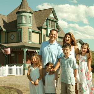
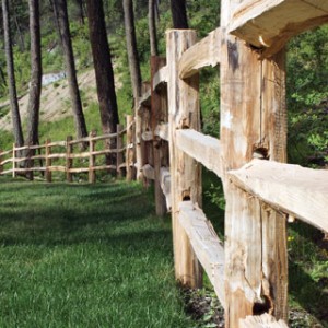
The Last Best Place
RiverBend Realty, a Montana-based real estate agency, came to Grid for help with marketing the last piece of lakefront property available on Flathead Lake in Northwest Montana. The marketing needed to speak to the quality and beauty of the property itself, while also persuading a high-end, discerning audience to reach out for more information.
Make It Worth Something
We started our work with the Landing at Angel Point by designing a simple logo that could be used on all future marketing collateral. It needed to be simple, so as not to distract from the collateral or photography, but memorable enough to tie all pieces of marketing together.
The next step was to get high-quality photographs of all aspects of the property, from the layout and improvements that had been made, to the unique textures and gorgeous landscaping that was already present. For the photography work we utilized our own in-house photographers on the grounds of the property itself, and acted as the creative director for a series of aerial shots that we arranged. We worked with the aerial photography company closely, outlining specific shots that we needed, and closely reviewing all shots to verify they were of the utmost quality
Using this gorgeous photography, we designed, copywrote and facilitated the production of a stunning 24-page booklet that detailed the features of the property. We made sure to highlight the characteristics that would appeal to this level of potential buyer, such as the availability of deep water moorage, the natural pebble beach shore, the extensive amount of site preparation, and the natural privacy that the location provided. The booklet also provided detail into the surrounding economy and lifestyle that a future resident would enjoy, framing the Landing at Angel Point as an incredibly attractive place to live, work and play.
We understood that the quality of the printed piece itself would also play a role in communicating the worth of the property. Grid was actively involved during each phase of the printing process, including meticulously proofing each page to ensure color accuracy and image quality.
The copy that we wrote for the booklet served as the foundation for many future collateral pieces, including an oversized, glossy postcard, three page folded brochure, and an informational website, all of which drove the viewer to contact the Real Estate Agent for more information.
Confidence In The Product
The client was incredibly impressed with the output of our work, and felt confident that they were showing the property in the best light possible when they approached potential clients. We continued to work with RiverBend Realty during the marketing phase of selling the property, including analyzing website traffic data, and making making marketing recommendations based on the trends we saw. For example, we noted a significant amount of traffic from relevant demographics in Japan, Germany and Italy, so we suggested that we include handy links for translating the website into the appropriate languages for each of these countries.
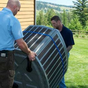
Starting New, Again
The owners of Great Northern Heating & Air were moving across the US and wanted to re-establish themselves under a new name. They recognized the importance in presenting themselves professionally right from the start, and turned to us for help in doing so.
First Impressions
Great Northern Heating & Air knew they would face a large market shift when they decided to relocate their business from the Twin Cities area to Northwest Montana. Not only would they need to rebuild their customer base from the ground up, but they would have to market to a demographic with a much different way of life than their previous customers. Our first step to building the new Great Northern Heating & Air brand was, therefore, to spend time evaluating where Great Northern Heating & Air services and products would fit in the current market space, who they would be marketing to, and how they could make a name for themselves right from the start.
Our first step was to evaluate their current competitors. We looked at things such as their market penetration, marketing strategies and campaigns, what demographics they were reaching out to and through what media, and even their level of participation in community events (which is a strong influencing factor for demographics in this region). Through this work we were able to identify specific market segments that were severely underserved, and ones where Great Northern Heating & Air could easily make a name for themselves.
We also detailed out fictitious representations of the demographics that we believed would be best served by the client. We identified their lifestyle choices, average statistical information (such as income, family size, house size, etc), communication preferences, and anticipated objections to switching from their current heating and air service company.
All of this information culminated in a market research document that included not only the information above, but outlined an overall marketing strategy that would reach the specific demographics, covered the service and product topics that had the most potential for response, and proactive addressed their objections to switching providers. This document would be a keystone reference for all future marketing campaigns - making sure they aligned with the opportunities that we had identified.
The market research document also drove our design decisions while creating the actual logo/brand that would represent Great Northern Heating & Air. We made iconography, font, color and slogan choices that were direct responses to our discoveries, such as making sure the logo reflected the heritage and beauty of Northwest Montana - a large reason why people choose to live, work and play in the area. We compiled all of our design decisions into a single brand and style guide that, combined with the market research document, would ensure all design work would remain consistent and on brand.
The Results
In the end, we settled on a sophisticated brand that not only harkened to the hard working nature of the residents of the area, but also portrayed Great Northern Heating & Air as being a modern, forward thinking business that took great pride in their work.
After seeing how our work consistently led to a better understanding of their business and marketing strategies, Great Northern Heating & Air has expanded our efforts to also include a complete business launch strategy, which will include information such as networking, advertising and sponsorship opportunities, event planning, and budget forecasting. We will then also put together a year long marketing plan, including detailed cost breakdowns and timelines for efforts such as direct mail and email campaigns, search engine marketing, social media, radio, print and television advertising, a client referral and rewards program, and relationship building with other local business to cross promote services and products (such as a local bank for financing needs, and hardware store for equipment).
The Approach
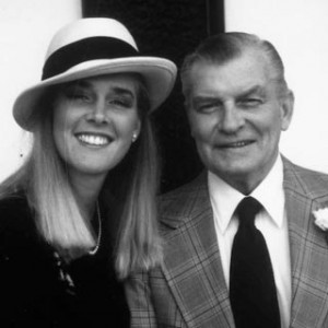
Helen Brooks, a licensed professional counselor and personal historian, approached Grid with a unique business idea - to preserve the life stories and memories of her clients using digital video and Brooks’ own well-honed interviewing skills. She had the necessary equipment and experience to begin her out-of-the-ordinary business, but recognized she was sorely in need of a strong brand to represent it.
A Warm Touch
As a Personal Historian, Brooks believes it is very important that her clients feel comfortable with her and her process, in order to facilitate meaningful, in-depth interactions. She knew she wanted the branding of her business, Life Histories by Helen, to do the same, using the warmth and personal touch that is the hallmark of her work.
We began by extensively interviewing Brooks to thoroughly understand her business, and to determine the best way to begin the branding process. During this interview, we discovered that the death of Brooks’ father had played a major role in her decision to begin Life Histories by Helen.
After suffering a stroke, Brooks’ father permanently lost his ability to speak. It was then that Brooks realized she would never hear her father talk about his life, their family, or be able to verbally share his most treasured memories. Since that time, Brooks has worked to help others avoid the same unfortunate realization, by preserving the memories of those who are dear to them through Life Histories by Helen.
Our creative team took this important component of Brooks’ business inspiration and utilized it as the central theme for all of her branding, beginning first with her logo. Using samples of Brooks’ own signature, we designed a custom Life Histories by Helen font to use as the main design element across her various marketing collateral. This font was combined with one reminiscent of the American Craftsman movement to evoke the feel of the past that Brooks’ work thrives on.
For Life Histories by Helen’s art, we chose to use a simple flower icon complemented by Earth tone colors of green and brown. The flower and simple colors symbolize life’s cycles and Brooks’ dedication to celebrating and preserving them for others. We also opted to incorporate personal photos of father and daughter, combined with Brooks’ sincere, heartfelt story, to offer the viewer a glimpse into Brooks’ craft. Black and white and sepia tones were used in the designs to convey the sense of history and heritage that Brooks’ business was born out of. Aesthetically, we chose colors, photography and design elements that illustrate Brooks’ personality, and the sense of tranquility that she brings to her interviews. Her collateral feels inviting, respectful, and safe.
Consistency
The branding we designed is used across all of Brooks’ marketing collateral: business cards, envelopes, letterhead, brochures, invoices and even the questionnaire sheet Brooks sends to a new client before their formal interview. This comprehensive, unified branding has brought a professional, committed look and feel to all aspects of Brooks’ business. The branded marketing collateral has a professional look and feel, while still conveying the same warm, caring attitude and personal attention that Brooks brings to her work.
Non-Profits Need Marketing, Too
Grid is extremely appreciative of the work that non-profits do for our communities. Some of our most rewarding experiences have come from working with these groups. Paws & Purrs Rescue came to us looking for an attractive brand and website that would help improve their rate of adoptions. Every member of our team cares a great deal about animals, so we were eager to jump in and assist!
Brand Perception
We began our work by holding a focused listening session between the client and our team. We asked a range of questions to better understand the clients work, the obstacles they face, and the successes that they’ve had. We inquired about previous marketing efforts, events they host, and reviewed marketing collateral that they already had. From this meeting it was clear that the largest hurdle to finding foster or forever homes for many of their pets was an unprofessional logo (which worried potential owners that the operation wasn’t held to a high standard), a confusing website experience, and a difficult application process.
Next was our research phase. Along with the client’s input, we identified local and national animal-related businesses who were doing well and brainstormed over the consistent trends we saw in regards to their branding, websites, and application process. We saw that iconography wise it was most typical to have paw prints, hearts or the silhouettes of animals. The most used colors were pastel versions of greens, purples, pinks and blues. Websites prominently featured one or two available pets, success stories, and easy links for donating or getting in touch.
Using all of this information we focused on designing a logo that would remain consistent with the industry standards (to promotes credibility), but also unique so that the client would stand out against their competitors. We finalized on a design that featured a cat, dog and rabbit icon as a subtle reminder that there were more than just cats and dogs available for adoption (they often took in abandoned ferrets, rabbits or hamsters). We choose a cool blue and white palette that was inviting and home-y, but still professional.
We then used this brand as a guideline for the website. Our biggest focus was to drive viewers to the most important pieces of information available on the site - how to donate / make a donation, pets that are available for adoption, and the adoption form. Since making a donation is the easiest and quickest way to become involved with Paws & Purrs Rescue, we highlighted that process by placing a “Donate” button in the top right hand corner of every page. For adoptions, we focused 3/7 of our navigation options on driving traffic directly into profiles of available animals, and featured two animals on the homepage at all times.
The adoption form was one of our biggest challenges. There were many “caveats” that would require the person filling out the form to provide additional information, or skip over certain sections that were not relevant. We utilized a robust form system that would allow us to set a series of intricate rules on the form, that would dynamically change the form as you progressed to show only the fields that were relevant to what you needed to fill out.
Forever Homes
After the new website launch, the client remarked at how incredible the difference in responses was. Before the new website launched, they often saw website traffic that bounced from the homepage without ever viewing the animals up for adoption, and saw an incredibly high amount of abandonment rate on their adoption form (indicating the applicant found it too complicated or involved to be worth the time). After launch, they saw increased website traffic on the pages that were most important, and were receiving more completed applications than they ever had before. We were very happy to have assisted in finding so many animals their forever homes.