Life Histories By Helen
Preserving Life Stories and Memories

Preserving Life Stories and Memories
Helen Brooks, a licensed professional counselor and personal historian, approached Grid with a unique business idea - to preserve the life stories and memories of her clients using digital video and Brooks’ own well-honed interviewing skills. She had the necessary equipment and experience to begin her out-of-the-ordinary business, but recognized she was sorely in need of a strong brand to represent it.
As a Personal Historian, Brooks believes it is very important that her clients feel comfortable with her and her process, in order to facilitate meaningful, in-depth interactions. She knew she wanted the branding of her business, Life Histories by Helen, to do the same, using the warmth and personal touch that is the hallmark of her work.
We began by extensively interviewing Brooks to thoroughly understand her business, and to determine the best way to begin the branding process. During this interview, we discovered that the death of Brooks’ father had played a major role in her decision to begin Life Histories by Helen.
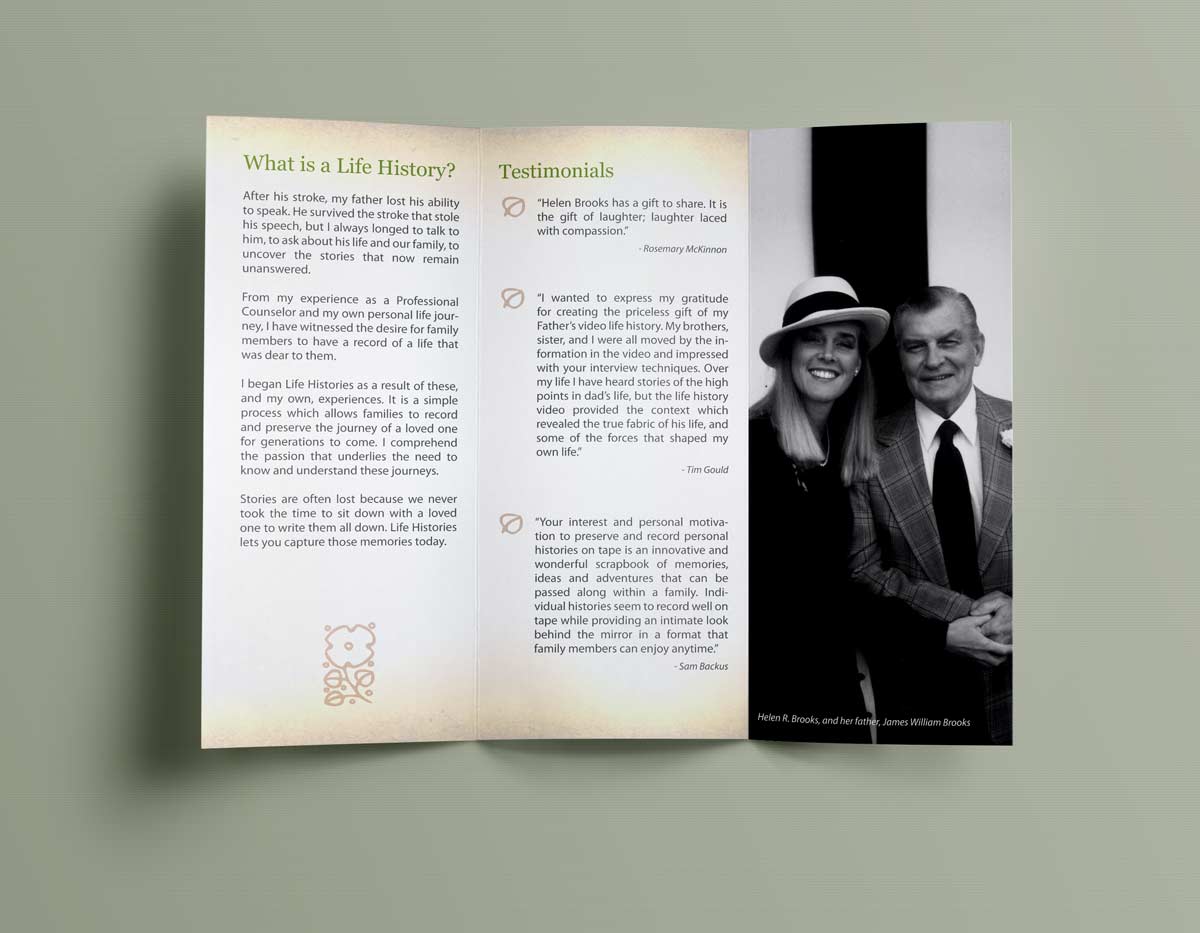
After suffering a stroke, Brooks’ father permanently lost his ability to speak. It was then that Brooks realized she would never hear her father talk about his life, their family, or be able to verbally share his most treasured memories. Since that time, Brooks has worked to help others avoid the same unfortunate realization, by preserving the memories of those who are dear to them through Life Histories by Helen.
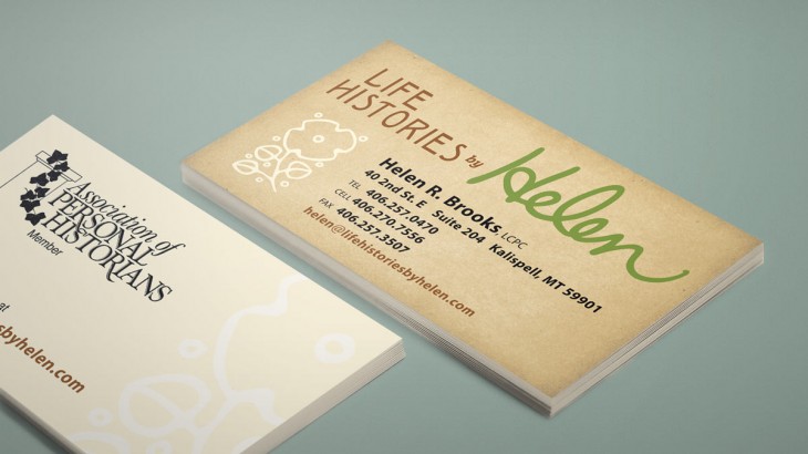
Our creative team took this important component of Brooks’ business inspiration and utilized it as the central theme for all of her branding, beginning first with her logo. Using samples of Brooks’ own signature, we designed a custom Life Histories by Helen font to use as the main design element across her various marketing collateral. This font was combined with one reminiscent of the American Craftsman movement to evoke the feel of the past that Brooks’ work thrives on.
For Life Histories by Helen’s art, we chose to use a simple flower icon complemented by Earth tone colors of green and brown. The flower and simple colors symbolize life’s cycles and Brooks’ dedication to celebrating and preserving them for others. We also opted to incorporate personal photos of father and daughter, combined with Brooks’ sincere, heartfelt story, to offer the viewer a glimpse into Brooks’ craft. Black and white and sepia tones were used in the designs to convey the sense of history and heritage that Brooks’ business was born out of. Aesthetically, we chose colors, photography and design elements that illustrate Brooks’ personality, and the sense of tranquility that she brings to her interviews. Her collateral feels inviting, respectful, and safe.
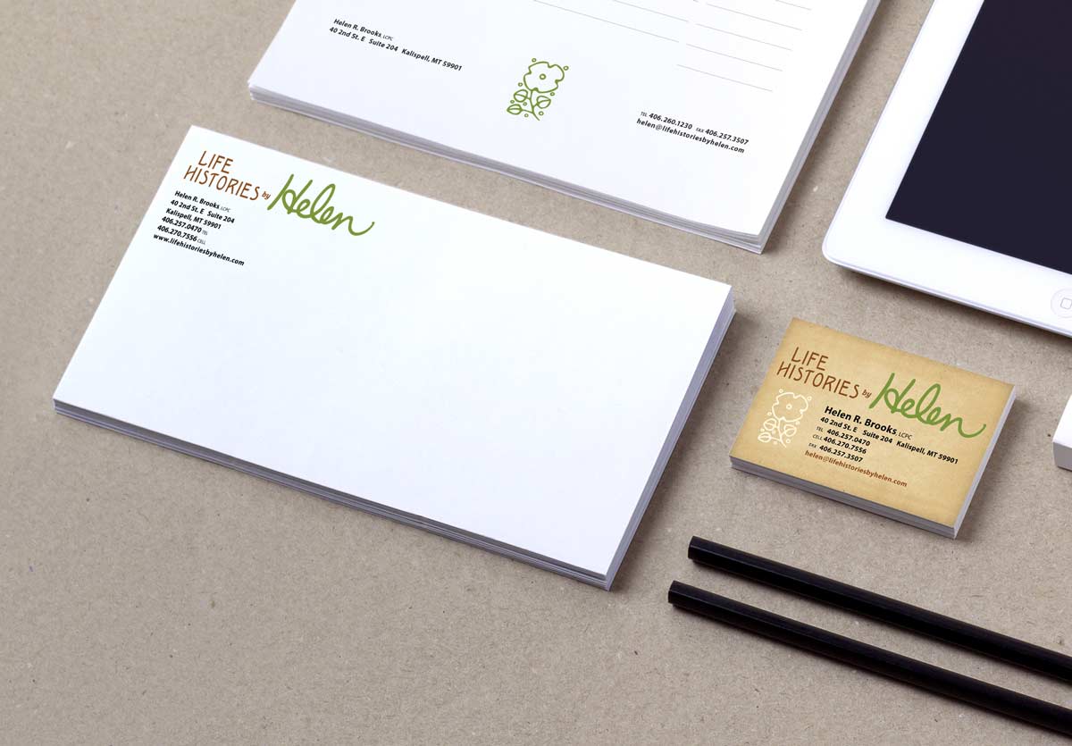
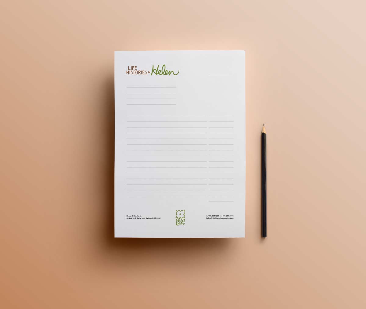

The branding we designed is used across all of Brooks’ marketing collateral: business cards, envelopes, letterhead, brochures, invoices and even the questionnaire sheet Brooks sends to a new client before their formal interview. This comprehensive, unified branding has brought a professional, committed look and feel to all aspects of Brooks’ business. The branded marketing collateral has a professional look and feel, while still conveying the same warm, caring attitude and personal attention that Brooks brings to her work.