Our Work: FourBridges Financial Group Branding
by on Jul 24, 2017

by on Jul 24, 2017
Not every business venture is planned as far in advance as your marketing agency would prefer you plan. Such was the case for FourBridges Financial Group, who came to us looking for advice and direction on a new brand, as they hit the ground running in the Rochester market. They needed all of your typical business staples - business cards, letterhead, etc - and quick, as they were actively recruiting and pitching new clients to come on board. With our strength and expertise in branding, we knew it was a task we were up for!
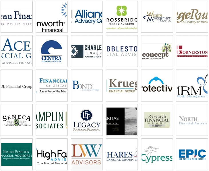
As we began our discussion, we discovered that FourBridges had worked for several month with an independent designer on brainstorming a business name and designing a logo. The results of that relationship were, unfortunately, not as strong as FourBridges had hoped they would be. It was clear to us that much of that disconnect had come from a lack of proper market research into both the local and national financial planner industry, and into their target demographics. At Grid, we firmly believe that all branding decisions should be made with data and available research in mind. Without an understanding of who your clients (current or potential) are, and what the industry looks like, it’s incredibly hard to stake an effective brand claim.
Along this line, we began our work by querying a host of data about not only the financial planner industry, but also about consumer financial trends in general. Were people feeling optimistic about their financial futures? Was there uncertainty in the marketplace? Would clients be looking towards FourBridges in an effort to feel secure in the choices they have made, or would they be looking to FourBridges for advice on maximizing their potential? Although there’s no clear cut answers to these questions, it allowed us to get a pulse on what clients in the Rochester area would expect from FourBridges, and thus what their brand needed to convey.
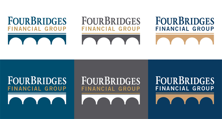
When it comes to branding for a new business, it’s vitally important that the logo have a look and feel that “sits right” with the business decision makers. That is, we can tell you what is viable with consumers - what looks professional, what will work well on advertisements, what will appeal to and be accepted by your demographics - but we can’t tell you the direction you are trying to take the business. With that in mind, we concepted five different rough logo directions that we felt would be equally as strong in the marketplace. Some were traditional, some were more modern. Some were artsy, some were rigid. Ultimately, it would come down to what “sat right” with the FourBridges team.
After less than 24 hours, a selection was made and we moved into finalizing the logo, which included selecting colors, adjusting treatments, and preparing the final logos for various applications.
We’re very proud of the final results, and have since worked with FourBridges on their business cards, letterhead and website!