Our Work: FourBridges Financial Group Website
by on Oct 16, 2018

by on Oct 16, 2018
There’s a phrase we tell every single one of our clients, when it comes time for us to build or redo their website. “We can build you a website that launches an actual rocket into space, from halfway around the world. But do you need it to?”
The idea is that your website doesn’t need to be full of bells and whistles, with live chat boxes, Twitter feed integration, online calculators, blinky GIFS or auto-play music. In fact, we consistently see higher user engagement on websites that have streamlined functionality and content, as compared to those that do not.
Consider this scenario. You’re interested in working with a financial planner to help you put together a successful retirement plan for you and your family. You begin your search as many of us do, by hitting up your favorite search engine and putting in terms that return results for financial planners in your area. As you are browsing, you encounter three distinct types of websites:
The Out-of-Date
You know an out of date website immediate by it’s “boxed” in style, where a majority of the content is constrained in a static-sized box centered in the middle of your browser. This website does not adjust it’s design when browsed on a mobile device. There may even be broken links or images. You immediately wonder when the last time this website was updated, if the company is still in business, and, most importantly, if this firm matches the personality of your more modern-age family.
The Overachiever
As soon as you load this website, you’re hounded by a pop up box inviting you to chat live now. Even if you wanted to chat with someone online, you wouldn’t be able to because the chat service says there are no agents currently online. You continue to navigate around the website, finding tons of “useful” tools, like an interest calculator or an image gallery of photos from last year’s holiday party, but nothing in the way of real substance. You’re not event able to find a clear list of their services, except for a mention about IRA limits in their last blog article (which was dated 2015).

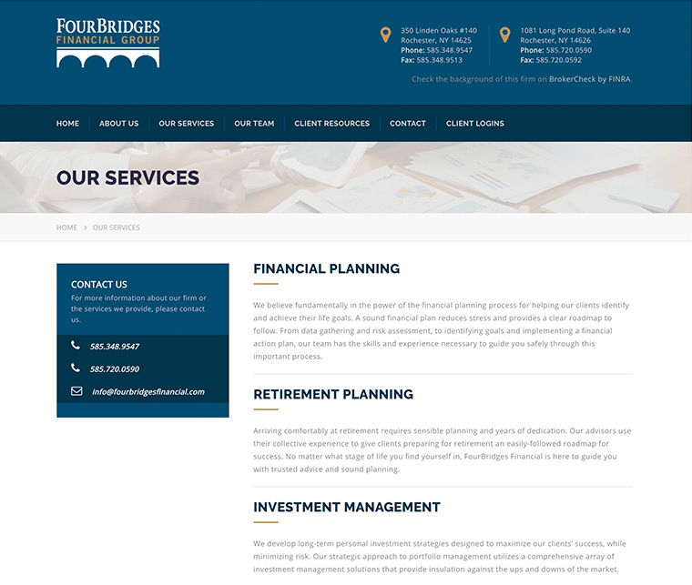
The Professional
When this website loads, you have a clear sense of where to find the information you are looking for. The navigation options are concise, with dropdowns for more niche content, that helps you quickly and conveniently move right into the information you are looking for - retirement planning. On this page is a helpful overview of their process, along with multiple ways to contact them, including phone, email or an online form. You are not pressed to choose your own appointment time just to get more information. Because of how easy it is to navigate the website, you naturally browse into other services, such as college tuition planning, and estate planning - you do, after all, have children to consider as part of your plan.
Our Work
When we began our work with FourBridges Financial Group, both our team and theirs were already on the same page about keeping the website as streamlined as possible. It should cover their major areas of work, feature their professional team, and should have a design and interface that would allow users to find the information they are looking for quickly. Addresses and phone number should always be considered a priority, and have a place at the top of the website no matter what size device you are browsing on. Users should be encouraged to contact individual team members directly, or submit general inquiries.
While the FourBridges Financial Group could have included more “flashy” or “interactive” content, it’s our belief that a professionally designed website, with a logical information architecture and high-quality content, should be able to engage and inform users without hiding. Remember that your users visit your website looking for some sort of information. The choice of whether help guide them quickly and easily to that content, or obfuscate it behind bells and whistles, is up to you.